Vice Kitchen
Designing a mobile-first knowledge and training platform for three Dublin restaurant kitchens — from the inside, as the person running them.
Overview
I designed it. I built it. I also run the kitchen it's deployed in.
Vice Kitchen is a mobile-first operations platform for the kitchen teams at Vice Pizza & Wings across three Dublin locations: Merrion, Phibsboro, and Dundrum. It replaces paper binders, WhatsApp messages, and tribal knowledge with a single application covering onboarding, daily prep, recipes, training, and hygiene compliance — accessible on any staff phone or tablet.
A static V1 is currently deployed and in use across locations. The full platform — Next.js with Supabase, role-based access, structured onboarding with quiz gates, and a dynamic prep management system — is the designed system documented in this case.
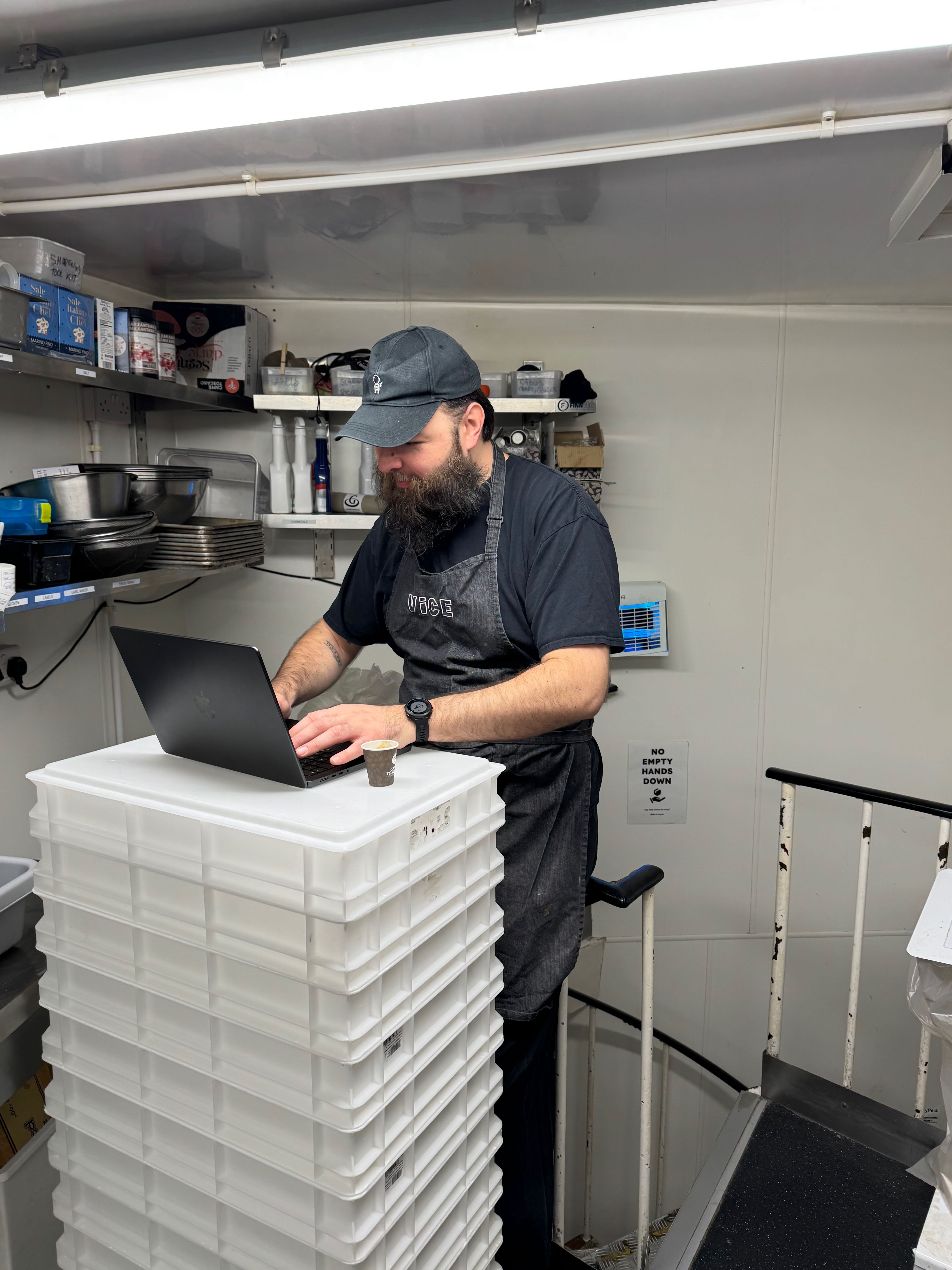
I designed and built this from inside the operation, as the person who manages the kitchen and experiences the daily friction firsthand. That proximity to the problem shaped every decision.
The problem
Scaling a kitchen that runs on tribal knowledge and paper
The problem statement was defined early and stayed fixed throughout the project:
"The operation is evolving from informal kitchen knowledge and experience-based execution toward standardised documentation, process-driven execution and scalable training."
Three specific pain points drove the scope: onboarding was slow, with new staff learning through observation and no structured path; knowledge lived in people, not systems — when experienced chefs left, it went with them; and consistency was hard to enforce across three locations without a shared reference, so standards varied by who was working.
The build constraint made it harder: the tool had to hold up during a live service. Fast-moving, loud, hands often wet or gloved. Every interaction needed to be completable in under five seconds, with one hand, in poor lighting.
Who I designed for
A kitchen chef who needs the answer in under five seconds
Marta Kowalski
Kitchen Chef / Line Cook · Dublin, Ireland
Mid-level chef working across multiple stations at a busy pizza and wings kitchen. Technically confident but new to this specific menu. Needs fast, reliable access to recipe specs and prep quantities during service, without interrupting the head chef or digging through paperwork. Every interaction has to work with one hand, in poor lighting.
Process
Research & Content Inventory
- Mapped friction through direct operational experience: inconsistent prep quantities across locations, knowledge held by experienced chefs with no documented path, and new staff with no structured way to self-serve during a shift.
- Conducted a full content inventory before any design work began — cataloguing what existed (dough SOP, recipe book, menu, brand style sheet, paper prep checklist) and what was missing (onboarding structure, progress tracking, recipe photography, documented prep methods for 20+ items).
- Filled content gaps with senior chefs using a deliberately low-friction brief: "explain it as if you're talking to someone on their first day — WhatsApp it or voice note it, doesn't matter." This removed the barrier for people who would never write a structured document but could explain something out loud.
- Established hard constraints before any UI work began: run on existing kitchen hardware, load instantly, navigable with one hand and gloved fingers.
Architecture & Information Design
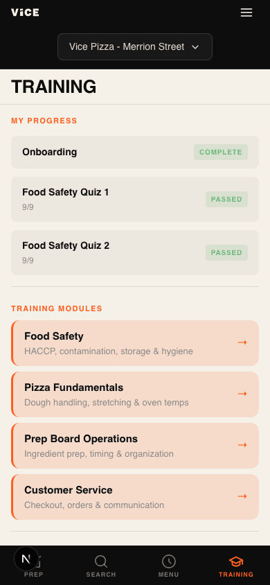
- The most important structural decision was defining two modes, not one application. Onboarding Mode is linear and gated: new staff move through seven sections in a fixed sequence — culture and values first, then compliance, then operational knowledge — with each section requiring a minimum quiz score to unlock the next. Compliance sections (hygiene, chemicals) carry a higher pass threshold than operational sections, reflecting their food safety importance. Reference Mode is free navigation, available permanently once onboarding is complete.
- Defined role-based content access across four staff roles: Junior, Mid, Senior, and KP — each with a different content matrix. The key decision: locked content is hidden entirely, not greyed out. A junior chef during a Friday service doesn't need to know that dough recipes exist. Greyed-out content creates questions. Hidden content does not.
- Built a brand-aligned design system derived from the Vice brand style sheet: Barlow Condensed headings, Vice Orange as accent only (10% proportion), warm off-white surfaces — every decision consistent with the existing visual identity rather than invented from scratch.
Feature Design & Key Decisions
- Dual-view recipe cards. Every recipe has two states: Quick View shows ingredients and weights only — no method, no photos — for mid-service reference when a chef needs to check a quantity fast. Full Guide is expandable with one tap and includes the step-by-step method, photographs, storage notes, and common mistakes. During a live service, nobody reads paragraphs. During prep and training, they need the full depth.
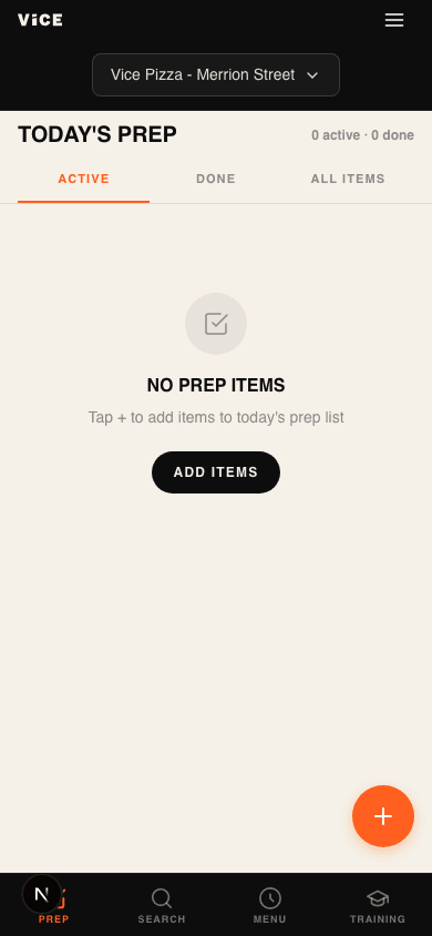
- Dynamic prep checklist. The paper checklist used two states: has it or needs it. The digital version introduces three — PREP, LOW, OK — and replaces fixed targets with day-of-week minimums: a Friday minimum for Caramelised Onion is different from a Monday minimum. When a chef opens the checklist they see the target for that day and mark against it, turning the checklist into a stock management tool. Admin controls allow the Kitchen Manager to set minimums per item per day, view completion history, flag items as 86'd, and export a weekly prep summary.
- Location-aware batching. Dundrum uses a larger mixer and higher batch sizes. Rather than duplicating recipes or maintaining separate content per location, a branch-aware batch selector adapts the output. One source of truth; the quantity changes with context.
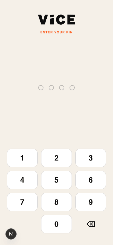
- 4-digit PIN authentication. No email or password. Staff are on phones, often in a hurry — a forgotten password creates friction at the worst possible moment. PINs are admin-generated, expire after 72 hours if unused, and after first login are tied to that device for 30 days.
V1 Rollout & Content Production
- V1 deployed as a static PWA — installable directly on kitchen phones and tablets without an app store. Getting staff onto the platform required one shared link, not an IT request.
- Introduced gradually by location and role, using real shift usage to surface gaps in content and UI clarity rather than running a formal testing phase disconnected from actual kitchen conditions.
- The full platform build (Next.js + Supabase) begins once the content production plan is complete: five photography sessions with senior chefs, recipe standardisation across all prep categories, and Kitchen Manager sign-off. Content before code — the platform is only as good as the information inside it.
The app — screen by screen
Login
PIN-based auth for kitchen speed
Prep Board
Daily prep list with persistent state
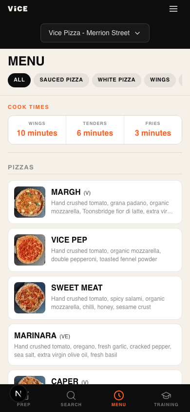
Menu
Full menu with cook times by item type
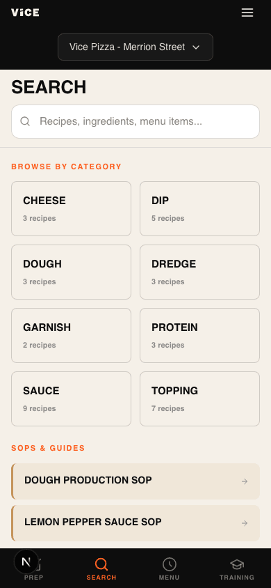
Search
Recipes, ingredients, SOPs — all indexed
Training
Modules with tracked progress per staff
Hygiene
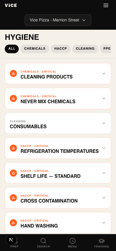
HACCP, chemicals, and cleaning rules
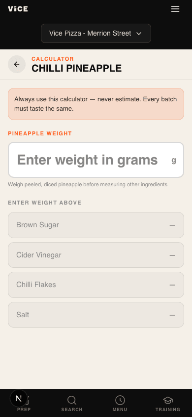
Calculators
Weight-based ratio scaling for toppings
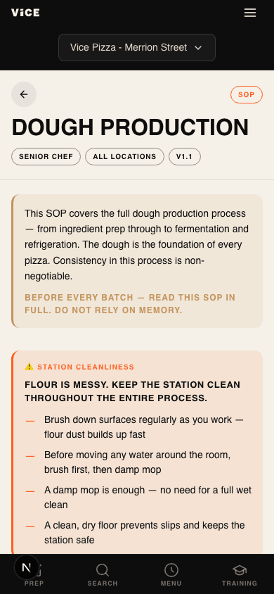
Dough SOP
Step-by-step with cleanliness callouts
Outcomes
Static PWA live and in use at Merrion, Phibsboro, and Dundrum. Staff access recipes, prep guides, and hygiene standards on their own phones during service without interrupting a senior chef.
Complete UX handover covering two-mode architecture, role-based access across four staff levels, dynamic prep management, gated onboarding with quiz scoring, and a full content inventory ready for build.
The brand style sheet, UI, and V1 codebase were produced entirely through AI — from curated source materials and structured direction, not from screens. The design process itself became a proof of the methodology.
Key learnings
Designing for a kitchen means designing for interruption. Every interaction has to be completable in under five seconds, with one hand, in poor lighting. That constraint shapes every UI decision more than any design principle. The dual-view recipe card, the three-state checklist, the PIN authentication — all of them came from watching what actually breaks during a Friday service, not from a research session.
Content before code is not a soft recommendation. The hard rule on this project: do not start building until at least 80% of content is ready. The architecture is only as good as the information inside it. Rushing the build at the expense of content quality produces something fast, empty, and useless.
Vice Kitchen has no Figma source files. The brand style sheet, the UI, and the codebase were all produced through AI — but the process was not outsourcing. Before a single prompt was written, all source materials were curated: the SVG logo, the physical menu photographed, interior photography from all three locations, Instagram shots, designer portfolio references, and accumulated knowledge of how the brand had evolved across sites. The AI had no way to understand the brand without those inputs. Every output it produced — font choice, colour approval, surface definitions — required human sign-off before anything was built. The curation is the design work. The AI executes the direction.
There are things AI cannot do. It could not confirm the Dundrum palette without a paint spec. It could not make a brand decision — every choice required a human call. It could not replace the designer who created the Vice identity. What it could do was systematise and document what already existed, fast. Knowing the boundary between those two things is what made the process work.