When the bottleneck is the operation, not the product
Turning a revenue-generating but manually-dependent assessment platform into something that could actually scale.
Context
A product that worked, but only because the team was doing the work
EVAL was a competence assessment platform from Grupo Anga that already generated consistent revenue. The problem was how it generated it: every new client required direct developer intervention. Evaluator assignment, participant management, report generation: each one a manual operation that couldn't happen without technical support.
The product was growing in revenue. The headcount needed to support it was growing alongside it. At some point, that equation breaks.
The problem
Every new client created manual work. That ceiling was going to hit.
The core issue wasn't user experience in the conventional sense. HR managers using EVAL found the interface workable. The friction was operational: too many steps required someone technical to execute. Onboarding a new client took a week. That week was made of manual configuration, not complexity.
The question the sprint was designed to answer: which parts of the operational burden could be absorbed into the product itself, and in what order?
Approach
Align on what matters before touching the interface
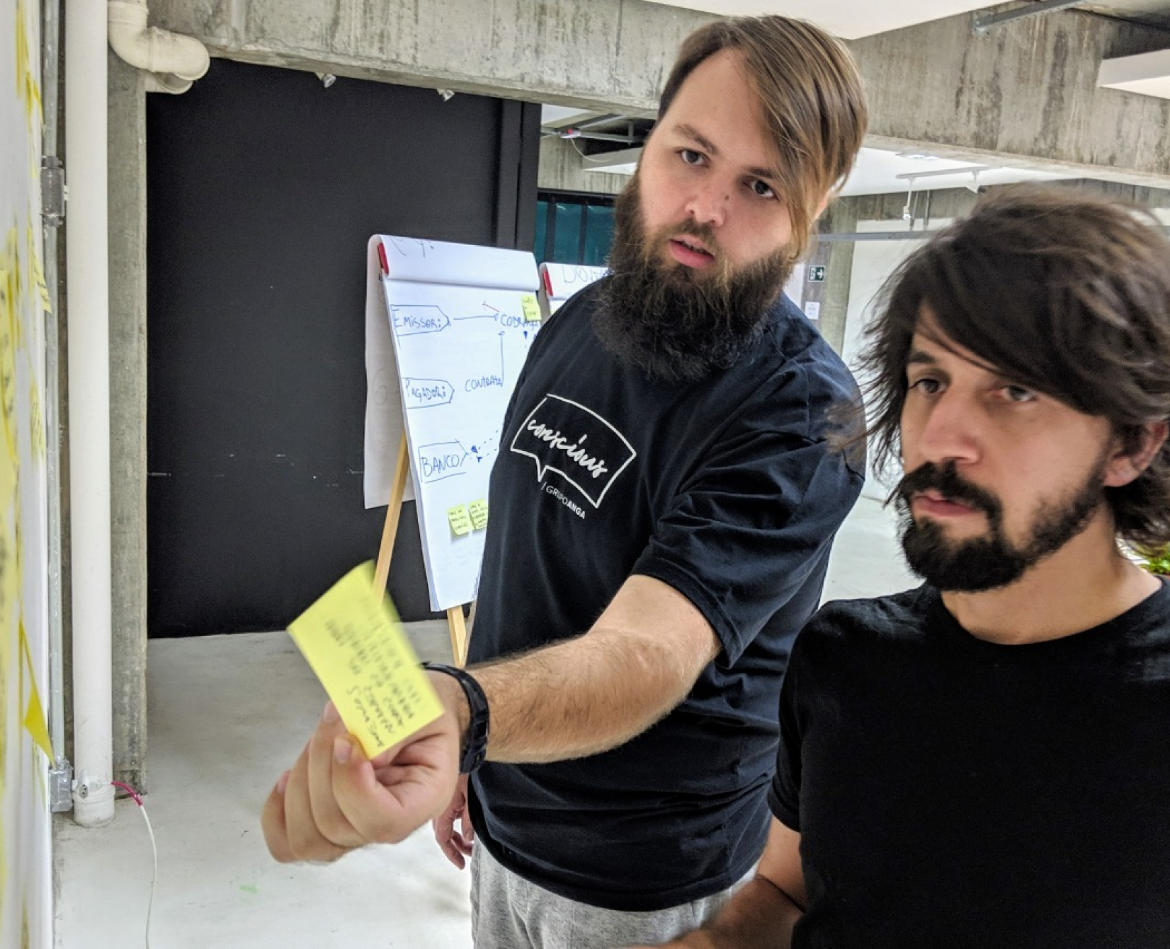
I started by facilitating a Lean Inception workshop with the product team and key stakeholders. Not to generate ideas, but to align on what success actually looked like and which problems were worth solving first. Skipping this step in a project with operational complexity is how you end up designing the wrong thing well.
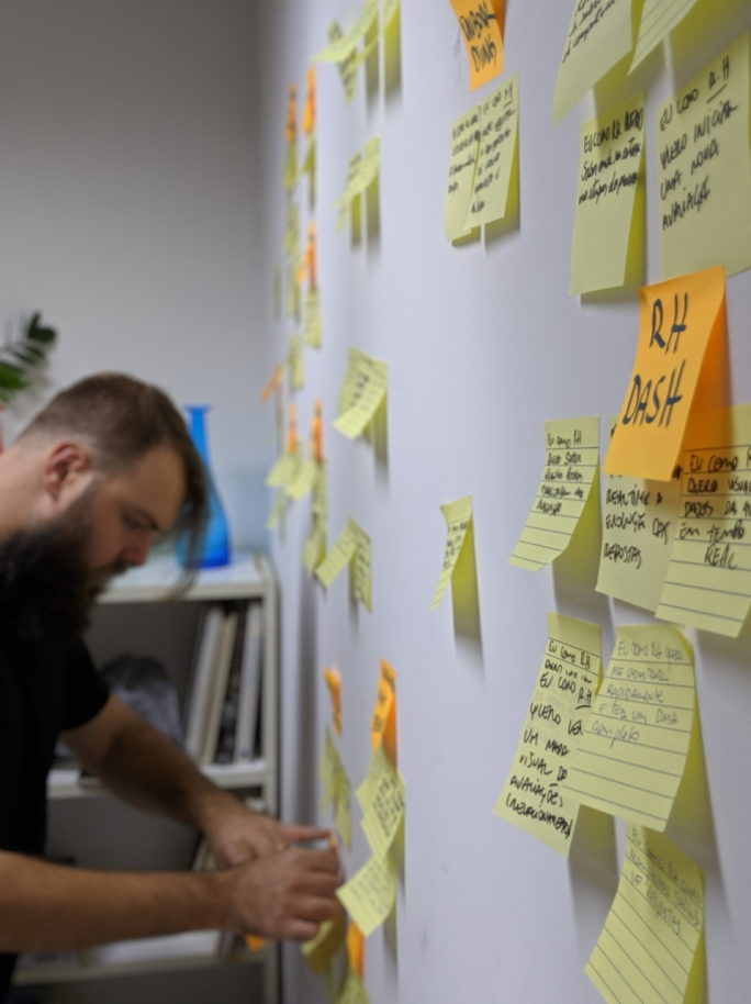
From there, I mapped the full operational flow, tracing every manual dependency and developer touchpoint across the assessment lifecycle. That map became the brief: these are the bottlenecks. These are the ones worth eliminating first.
Design decisions were evaluated against operational impact, not just usability. A flow that was pleasant to use but still required a developer handoff wasn't a solution.
Process
Product discovery & alignment
- Facilitated a Lean Inception workshop to align stakeholders around product vision, goals, constraints, and success metrics before any design decisions were made.
- Mapped the full operational flow, exposing manual dependencies, developer bottlenecks, and scalability limitations across the assessment lifecycle.
- Defined and prioritised features based on business impact, operational efficiency, and user value, establishing a clear scope for the sprint.
Experience strategy & direction
- Translated business and operational challenges into clear experience requirements and system-level decisions, defining what the product needed to handle autonomously versus where human oversight still made sense.
- Collaborated with the UI designer to ensure proposed solutions reflected the product strategy and addressed the operational pain points identified during discovery.
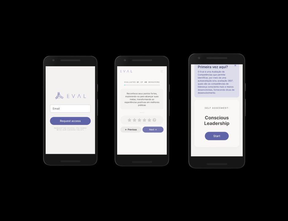
- Reshaped key flows: client onboarding, participant selection, survey completion, and automated report generation.
Validation & risk reduction
- Designed usability test plans focused on critical flows: onboarding, assessment completion, and report interpretation.
- Conducted testing sessions with target users to validate assumptions and identify friction before development began.
- Synthesised findings into actionable recommendations that reduced implementation risk and caught edge cases before they became support tickets.
Outcomes
Onboarding time reduced from one week to two days by eliminating manual configuration dependencies.
Increase in sales after the redesigned experience was introduced to market.
Developer dependency on routine operations was significantly reduced, allowing the team to onboard new clients without technical intervention on every setup.
Key learnings
Operational inefficiencies are often the biggest design opportunity in mature products. The UX problem isn't always on the screen. Sometimes it's in the spreadsheet someone is filling out before the screen even loads.
Aligning stakeholders early around product vision and priorities reduces downstream waste. Time spent in a Lean Inception is time not spent redesigning features that never needed to exist.
The most valuable design decisions in this project were the ones that simplified operations and enabled business scalability behind the scenes. Nobody celebrates the onboarding flow that disappears. But they feel it when it does.