From silent drop-offs to a journey candidates could follow
How a shift in perception, not a structural overhaul, increased candidate completion by around 45%.
Context
A platform that worked, but that candidates couldn't read
Eureca was a talent attraction platform built by Grupo Anga, designed to manage multi-step recruitment processes. The product existed and worked technically. The problem was that it had been built without design involvement from the start. In fast-growing companies, engineering ships what's necessary, and experience comes later.
When I joined the team, "later" had arrived. The platform was running, but candidate behaviour was revealing something the data couldn't quite name: interested candidates were leaving mid-process. No complaints, no explanation. They just left.
The problem
Candidates were abandoning due to uncertainty, not lack of interest
The funnel had multiple stages: application, questionnaires, written challenges. But none of this was visible to the people living the experience. A candidate who completed the initial sign-up genuinely believed they were already competing for the role. When another step appeared with no warning, many dropped off.
The feeling of being in the dark drove more exits than any difficult step would have. Support ticket volume confirmed it: the top questions were "where am I in the process?" and "what do I still need to do?" Questions the system should have been answering on its own.
What needed to change wasn't the funnel. It was how the funnel was perceived.
Approach
Don't redesign what doesn't need redesigning
The first decision was the most strategic: understand the problem precisely before reaching for solutions. That meant talking to candidates who had abandoned, not to confirm hypotheses, but to understand the emotional state of someone who gives up. The pattern was consistent: not laziness, not disinterest. Candidates had simply run out of map.
I validated findings through usability testing with 50 real candidates. The pattern repeated: even when information technically existed on the interface, it was not perceived as a coherent progression. The problem was communicative, not structural.
From that, two solution axes emerged:
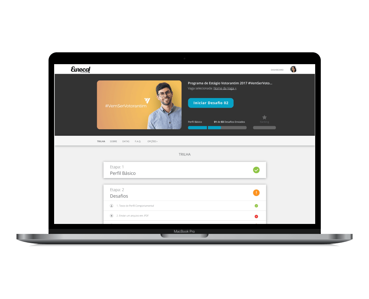
Make the journey visible from the very first step. Candidates needed to know what lay ahead before committing. Not as a legal disclaimer. As a clear progress experience. I drew from level systems in video games and built a progression component showing where they were, what came next, and what was required to advance.
Reduce initial friction. Mandatory full-profile completion before applying was a real barrier for candidates still exploring. The solution: let them apply first, then complete their profile progressively, once emotional engagement with the role had already been established.
Process
Discovery & Research
- Conducted interviews with candidates who had abandoned the process, mapping emotional friction points and the specific moments uncertainty appeared.
- Found that candidates did not perceive the recruitment funnel as a multi-step journey, even though the information technically existed on the interface.
- Validated findings through usability testing with 50 real candidates, confirming that uncertainty and lack of progress visibility were the primary drivers of abandonment.
Ideation & Flow Redesign
- Redesigned the application flow to communicate all stages clearly from the very first interaction, before candidates had committed significant time.
- Created a progression component inspired by video game level systems: where you are, what's next, what's required to advance. Familiar logic, applied to a recruitment context.
- Reduced initial friction by replacing mandatory full-profile completion with a lightweight sign-up. Candidates could apply first and complete their profile progressively throughout the journey.
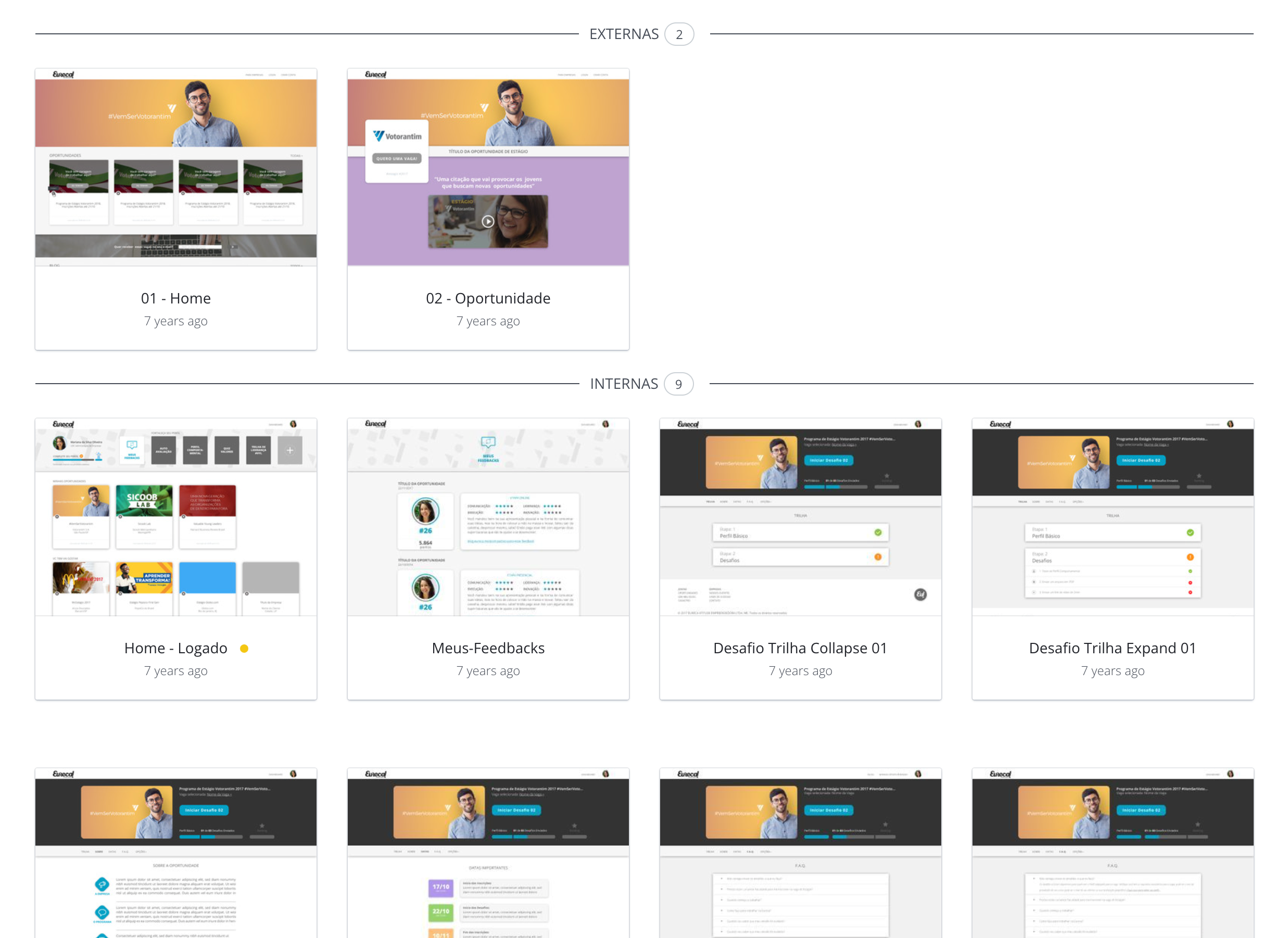
Prototyping, Testing & Delivery
- Designed the complete platform interface and built interactive prototypes in InVision for validation with real candidates.
- Tested prototypes to validate clarity, perceived effort, and understanding of the process progression, iterating based on what candidates actually expected rather than what the brief assumed.
- Collaborated closely with developers during implementation: refined interactions, adapted designs to technical constraints, and contributed directly to front-end implementation using Angular.
Outcomes
Increase in completion rate across the entire recruitment journey.
Reduction in support tickets related to the application process.
Candidate understanding improved without changing the underlying funnel structure, confirming the hypothesis that communication was the UX problem, not the process itself.
Key learnings
Users abandon processes due to uncertainty more than effort. When the path is clear, the willingness to walk it increases, even when the effort itself hasn't changed.
The most impactful UX improvements often come from reorganising perception and feedback rather than redesigning entire systems. Reorganising communication proved more effective than any structural redesign.
Large-scale refactors increase delivery time and operational risk. Incremental improvements combined with continuous product ownership would have created a more sustainable long-term evolution for the platform. It's something I carry into every project since.